
Roles
- UX Research & Testing
- Visual Design
- Front-End Development
Deliverables
- User surveys
- User personas
- Competitive analysis
- User stories & flows
- Paper prototype
- Wireframes
- User testing analysis
- GitHub Page
Tools
- Google Forms
- Figma
- HTML & CSS
- Git | GitHub
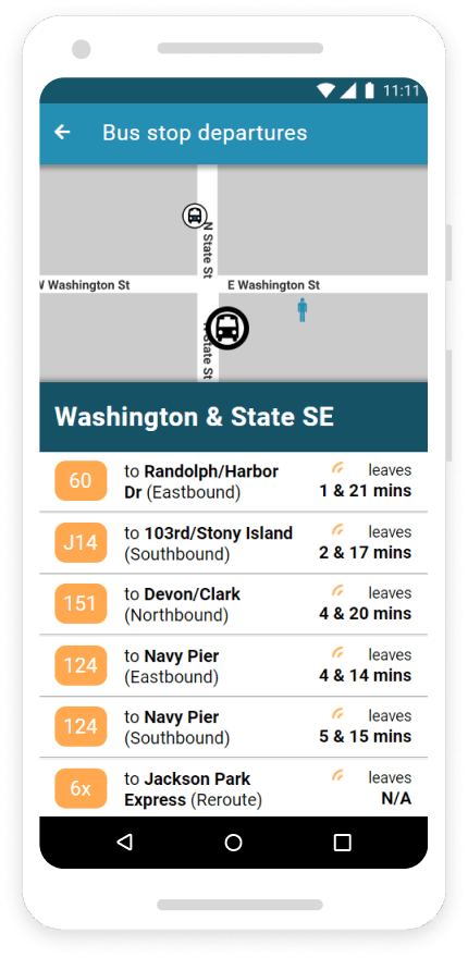
Problem
Riders are complaining about not knowing when their bus is arriving to the Washington & State stop. They can no longer assume the bus they see in the distance is theirs because several new bus routes have recently been added.
Solution
Busy Bus is a minimum viable product (a single screen in this case) designed to logically show riders what buses are arriving next to the Washington & State stop. This was my first project completed in the Bloc UX design apprenticeship program.
Research & Strategy
User Surveys
The first thing I wanted to do was to determine whether an app would indeed solve this problem. I used Google forms to conduct a survey. The results confirmed users would like using an app to track the arrival time of their bus. That was really all I needed for this very basic MVP, but I also learned of desired features for future versions of the app.
67%
would be more inclined to take the bus if they had real-time information for it in a mobile app
94%
want to see where their bus currently is on the map (Uber style)
72%
want to be able to easily find lists of all stops on bus routes
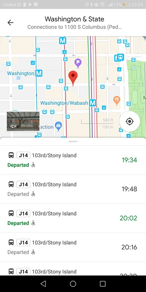
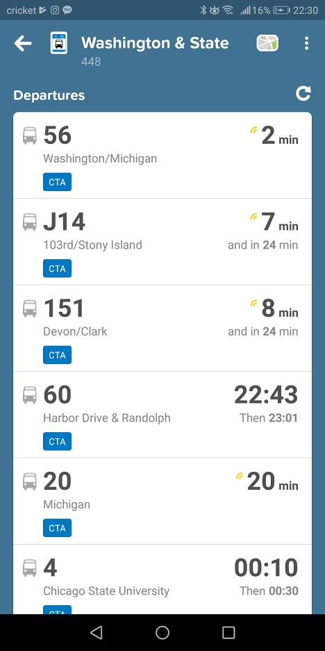
Competitive Analysis
While waiting for survey results to come in, I analyzed the strengths, weaknesses, opportunities, and threats of two competing apps: Google Maps and Citymapper.
 View
SWOT analysis
View
SWOT analysis
Conclusion
Final Thoughts
I had a couple big takeaways in the design process for this, my first UX project.
1. I need to make sure I fully understand what's expected of me before creating and deploying user surveys. The assignment was to create only a MVP specifically for the Washington and State stop. I should have only been asking bus riders focused questions about what they'd want to see, or what frustrations they currently had, with app screens for a specific bus stop. Instead, I asked survey takers about all kinds of features they might want in a bus app. This reduced the value I took from the survey results.
2. I should narrow my focus when performing competitive analyses to only the features in question. While I learned a lot about all that Busy Bus could be, many of the takeaways I got from my competitive analysis didn't apply to Busy Bus in its MVP state. I could have moved forward in my design sooner if I hadn't spent so much time trying to analyze every little feature in Google Maps and Citymapper.