A dining experience tracker currently in development. Expected release in late 2022.
view marvel prototypeRoles
- UX Research & Testing
- Visual Design
- Brand & Identity
Deliverables
- User surveys
- User personas
- Competitive analysis
- User stories & flows
- Sketched wireframes
- Digital wireframes
- User testing analysis
- Logo sketches
- Style guide
- Hi-fi prototype
Tools
- Google Forms
- draw.io
- Figma
- Invision
- Marvel
- UsabilityHub
- maze.io
Problem
Ever sat down at a restaurant and thought to yourself, “Man! I wish I could remember what I had last time I came here! Was it even good?” Or ever wished you could remember that place where you and your friend ate a couple months ago? Spork is here to help.
Solution
Spork allows users to track (or “spork”) each restaurant visit. By entering things like the date, restaurant, whom they ate with, and ranking each menu item they tried, users can not only remember what they want to, but they can also see statistical insights about their overall dining habits. And who knows? Maybe by seeing what you’ve already tried, you’ll be inspired to try some new dish or restaurant next time.
Research & Strategy
User Surveys
The idea for this app came about from one friend mentioning he wished there were an app similar
to BG Stats (an app that tracks board game plays) for eating out with friends. While it sounded
like a great idea from the get-go, I needed to make sure there was actual interest in it. So, I
conducted a survey with 37 people who like eating out and learned the following.
(Note: The survey was conducted in February 2019, pre-Covid.)
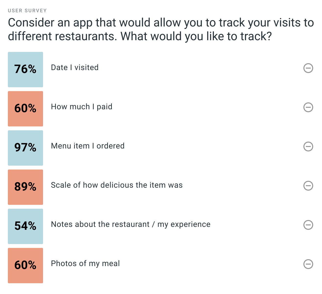
Over 50% of respondents said they sometimes or often wish they could remember:
60%
what they ordered the last time they went to a restaurant
57%
if they actually liked the item they ordered
54%
the last time they ate at a certain restaurant
Next, I introduced a hypothetical app for tracking restaurant visits and asked users what
features would be useful. This really shaped my MVP.
(Note: I conducted this survey at the start of my UX career. My approach these days would have focused more on discovery rather than telling them about a hypothetical app, and having acquiescence bias shape their responses.)
I also learned that most users (92%) would want an app that implemented predictive text based
on location to find nearby restaurants. Through various comments in the survey, I also
discovered compiled statistics were an attractive feature for this potential app.
After introducing users through the above questions to what this app could be, I asked the most
telling question of all:
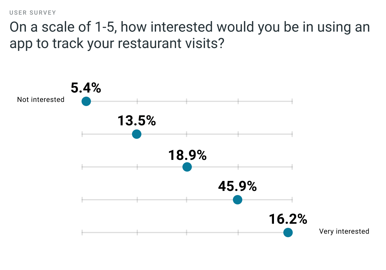
With over 80% of respondents somewhat interested or very interested, there was no longer any doubt in my mind that this was an app worth creating.
User Personas
I developed two personas to help encapsulate what specific needs both teachers and administrators had. I used these personas as a reference point to ensure my design was meeting their needs.
Alex Reynolds
Urban attorney
Frustrations
- Complicated apps that demand a lot of time
- Can’t share play statistics with friends from within BG Stats app
- Can't track everything like board game plays
Goals
- Quickly track restaurants visits like he does board games
- Remember what NOT to order
- Share stats of restaurant visits with friends
Julia Brown
Rural administrative assistant
Frustrations
- Experiencing poor service or bad food after trekking into the city
- Lack of restaurant choices in town
- Forgetting if she’s already been to a restaurant
Goals
- Be able to reference where she’s already been
- Not go back to a restaurant with poor service
- Try a new dish every time at repeat restaurants
Fiona Andrews
Urban undergrad student
FRUSTRATIONS
- Forgetting what menu items she’s already tried
- Expensive restaurants with mediocre food
- Apps that don’t feel familiar
Goals
- Keep food photos in an intuitive location
- Remember if the cost was really worth it
- Keep track of what she's tried already and with whom she tried it
Competitive Analysis
While awaiting survey responses, I looked at Spork's potential competition. There are incredibly no direct competitors to this app, but I still wanted to make sure it felt familiar and intuitive. Here are some of my key takeaways:
1. There is a great opportunity for Spork to enter the market. The following apps all let users mark places they've been, but greatly limit the amount of details one can add about each visit. Additionally, users can often only mark one visit to that location, making it impossible to visually compare each of their visits. Spork would take what exists to the next level in terms of number of details tracked.
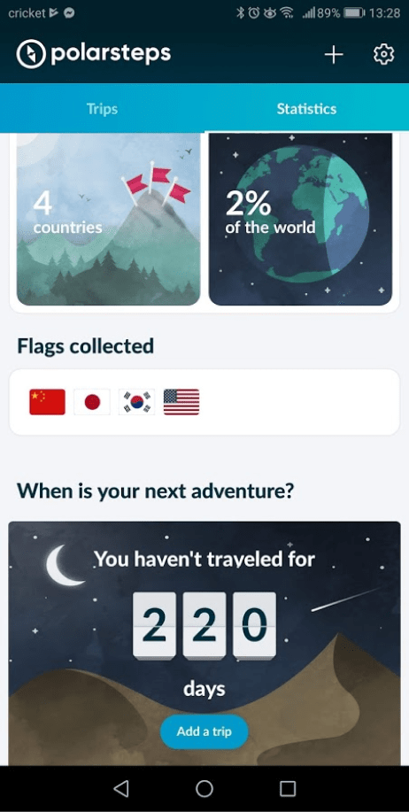
2. BG Stats initially inspired this app and offers great features. However, I wanted an app that felt less like a simple interface for interpreting spreadsheet data. I wanted my app to have a more pleasing visual aesthetic, even when users looked at their statistcs. While Spork still has a way to go to be as visual, Polarsteps was a huge inspiration to show how aesthetically appealing statistics could be.
3. Stars aren't the only way for users to rank things! Seeing applications of other rating systems was very helpful down the road as I started iterating on my designs. Since users of Spork would have the option to rank two different things (menu item taste and overall visit experience), it became important to differentiate the two scales.
Information Architecture
User Stories
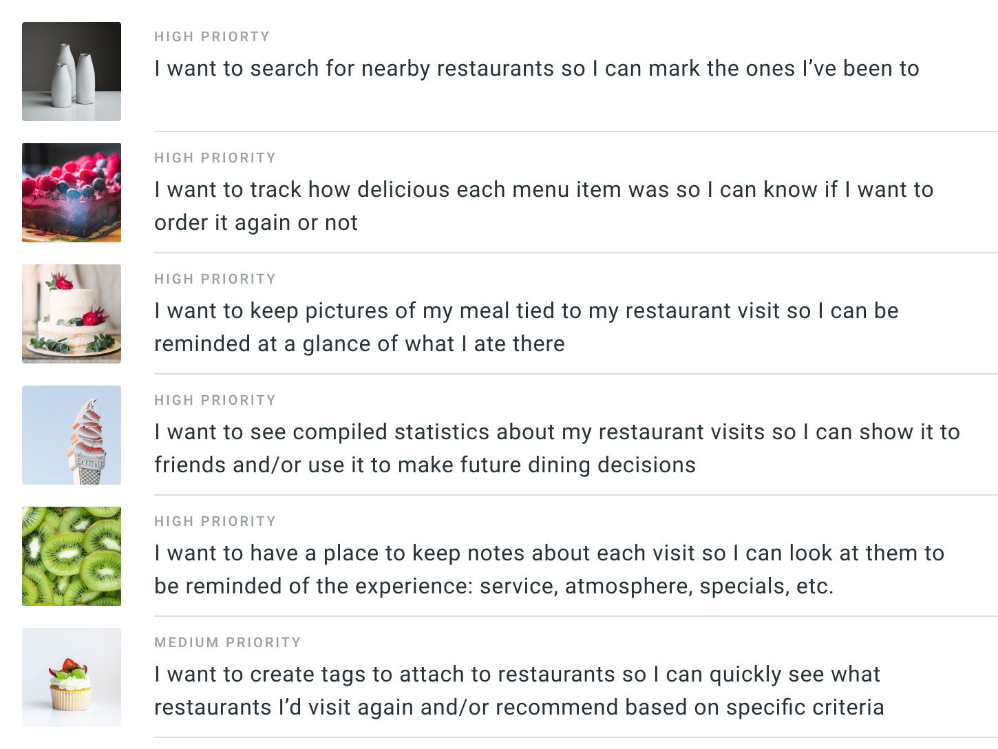
With my survey analysis and personas in hand, I thought about the specific tasks the users might need to complete and rated those tasks by level of importance as user stories. There were a lot of great ideas, but I needed to try to keep scope creep to a minimum for the sake of time.
User Flows
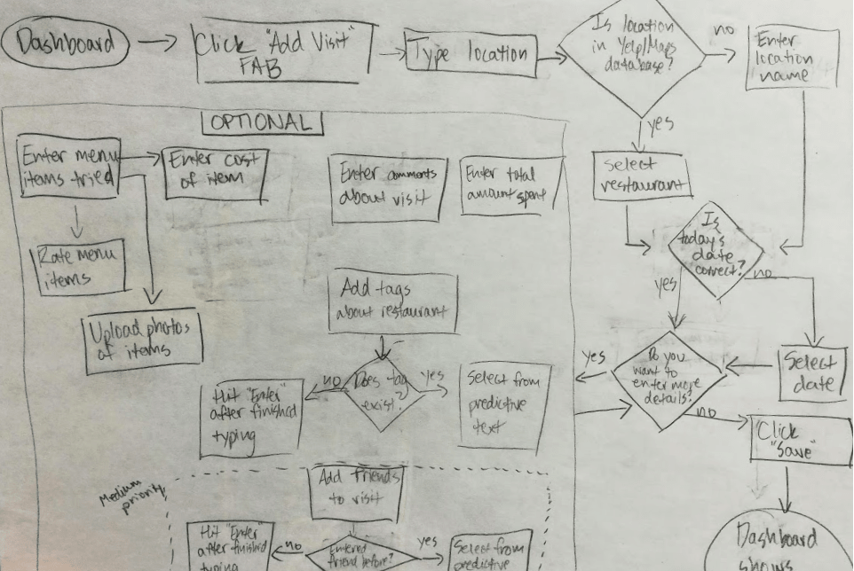
Having outlined the most important tasks for my minimum viable product, it was time to start thinking about what steps the user would need to do to complete those tasks. Thus, I created user flows to help guide me when I started wireframing.
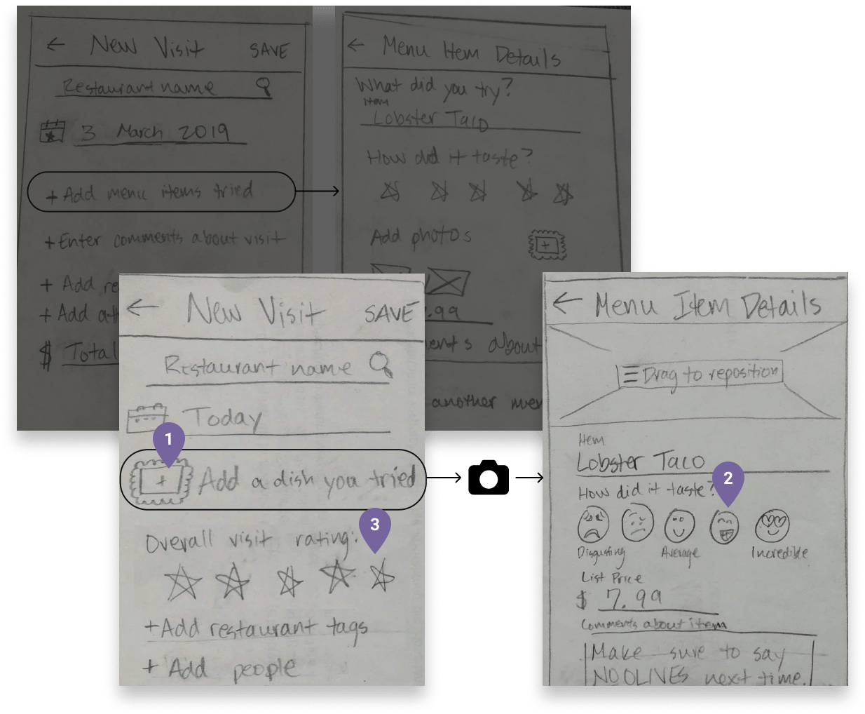
Wireframe Sketches + User Testing
Using my user flows and stories as guideposts, I sketched out some wireframes and put them through user testing. I wanted as must user input as possible before spending time digitizing my wireframes. I ended up with three different iterations of just my sketches. My biggest takeaways from these tests were:
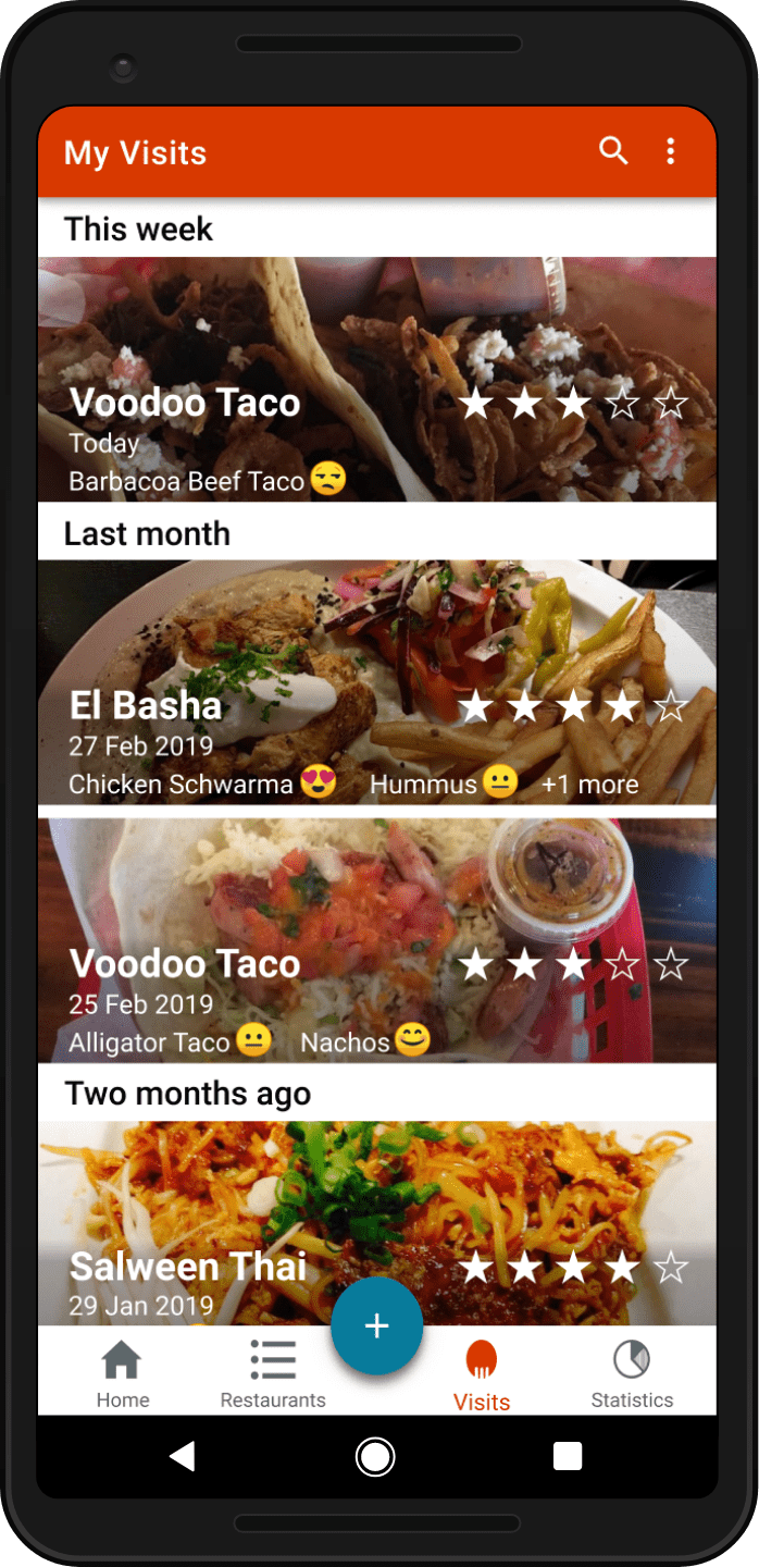
1. Lots of people love taking pictures of their food. As such, the "Add Photo" option shouldn't be a buried option, but stand out on the first page.
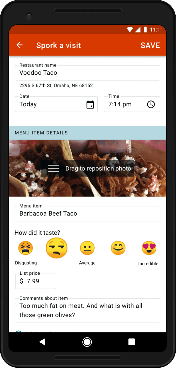
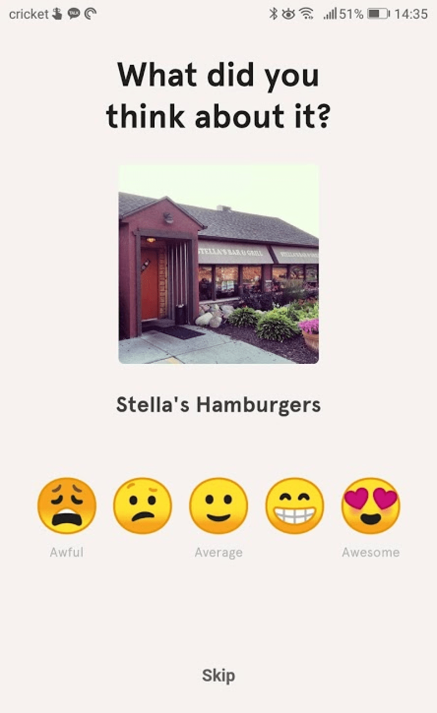
2. Stars aren't the right way to rate the taste of food. One user explained his reaction to food is almost emotionally felt. When I asked testers if emojis would convey reactions to food better, they all liked the idea.
3. There should be a separate way to rate the visit (for service, ambiance, etc.), not just the taste of the food.
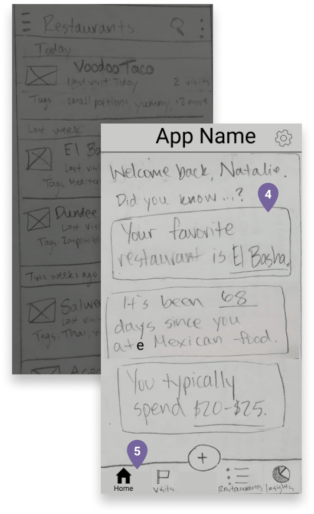
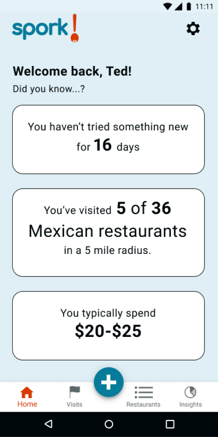
4. The landing page for returning users should convey fun information in a visual way. Interesting personal dining statistics would be more fun to see than just a list of restaurants they visited. A couple users really wanted the app "gameified" by adding achievements like trying every Mexican restaurant in the neighborhood. Adding a home screen with pulled-out statistics was a good start for my MVP, and eventually, would be a good place to get users excited about different "missions" to earn achievements.
5. An easily visible bottom app bar was much more intuitive than navigation buried in a hamburger menu.
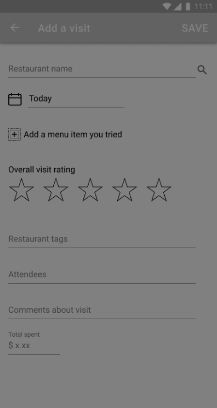
Digital Wireframes + User Testing
I incorporated the above feedback and created some digital wireframes. I user tested and iterated on these as well. I'm really glad I did, too, because there were a few key changes I needed to make before I spent time refining them into hi-fi mockups.
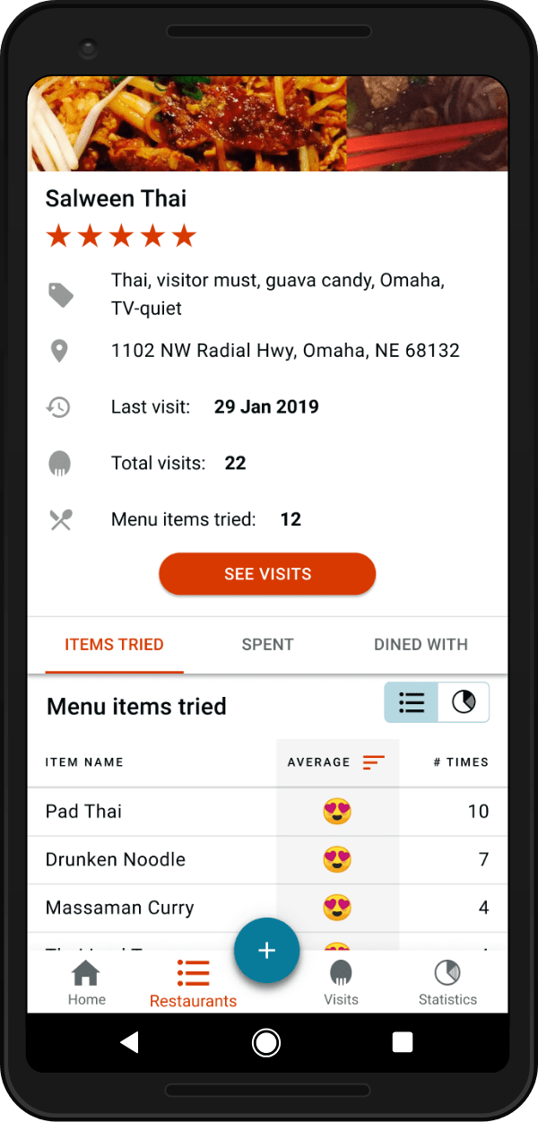
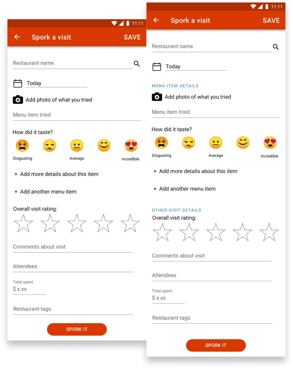
1. The thing people want to track most (the menu item they tried) didn't make sense to put on a separate page. Adding the name, picture, and rating of the menu item(s) they tried was the most important thing to testers, so I realized it should be the first thing they are able to enter when they "Spork a visit." They shouldn't have to navigate to a different page to enter these details.
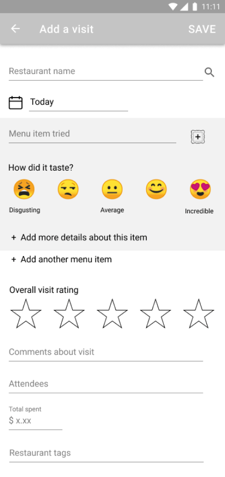
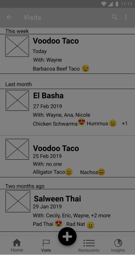
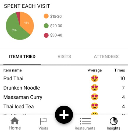
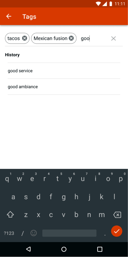
2. It should have come as no surprise to me that the people who like to take pictures of their food also want to be able to easily scroll through those photos. Quickly skimming large pictures is a lot easier than a bunch of text with a tiny thumbnail. So I completely redesigned the Visits page to highlight photos. I also realized if they wanted to search quickly, the list items should include the menu items' rankings. I experimented including whom people ate with, but most users didn't feel this was that important and that it added too many words.
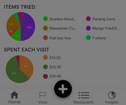
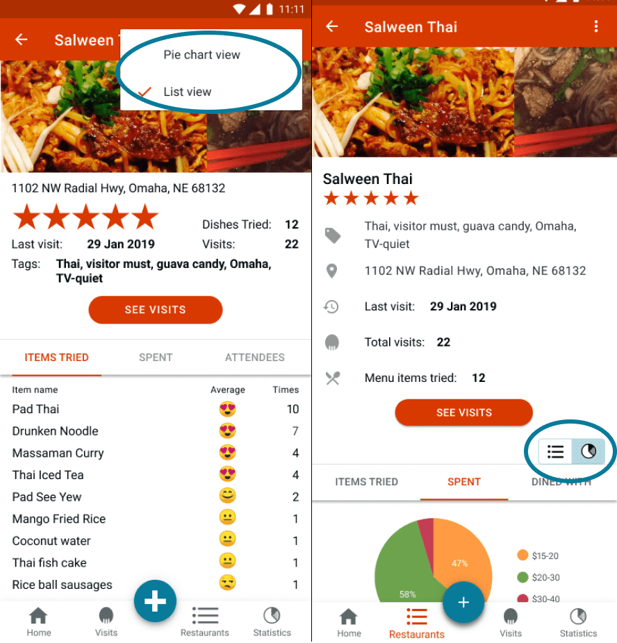
3. Not everyone loves pie charts. Additonally, lists can provide more metrics, so it made sense to present some data as lists.
Branding
Identity Creation
After refining my wireframes, it was time to figure out what the look, feel, and name of the app would be. This was a struggle because I wanted to come up with a name that helped explain what the app did, but also really liked the idea of a short, catchy name.
At first I toyed with the names Dinary (a portmanteau of “dining diary”), NomNotes, or Plate Rate. But I found all of these either failed short of encapsulating what my app did, or just didn’t sound very good. When the name Spoke came to me, I initially dismissed it because it said nothing of what the app was for. But then I considered Yelp, Google, and Foursquare--none of which have a title explaining the company’s purpose.
So I asked friends for their opinions on what the name should be. Ultimately, we agreed Spork would be a great name for a restaurant app and were all surprised it didn’t exist already. We loved that it worked well to verb-ify as in, “Give me a second. I need to Spork this [restaurant visit].” It also made deciding on a logo a million times easier since the name is a physical object.
After experimenting with lots of logos, my final decision was based off of preference tests with friends and other students at Bloc.
For colors, I knew I wanted to use red or yellow both colors often associated with restaurants / food. I chose my dark orange-red because it felt foody and worked well with white type on top of it (a common trend in Material Design, which I used as guidelines for much of my styling). The blue came from experimenting with what went well with red that could be a background to white text. Green felt too Christmas-y.
See branding experimentationVisual Design
Hi-fi Mockups + User & Preference Testing
By applying my branding to wireframes, I created mockups to put to the test. Several more rounds of user testing led me to make the following changes:
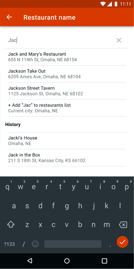
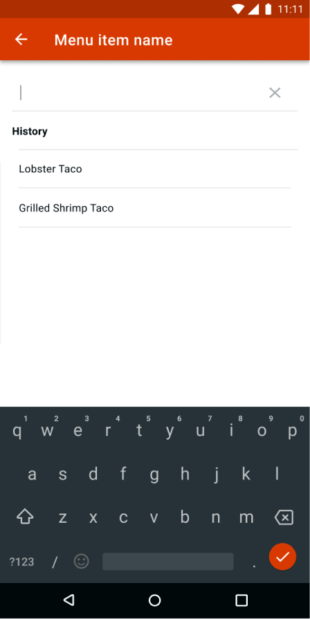
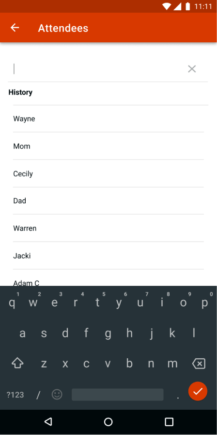
1. Testers wanted to see how the search fields would work, to ensure predictive text would help them quickly add previous dishes, friends, etc. While I knew I wanted this to be incorporated, I hadn't realized that it was an important feature I needed to give some design thought to.
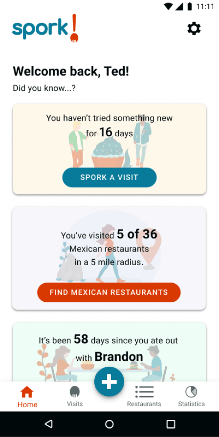
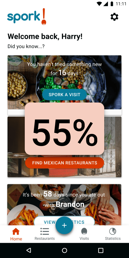
2. Just having interesting statistics on the home page wasn't enough. Users wanted widgets on the home page to be interactive, to give them a clear sense of what to do next. I added call-to-action buttons on each widget and then preference tested whether I should use graphics or photos. While only 55% percent of testers chose photos, their comments convinced me it was the right choice. It matched the rest of the app better and food is such a visual thing anyway. Seeing food photos makes people want to eat.
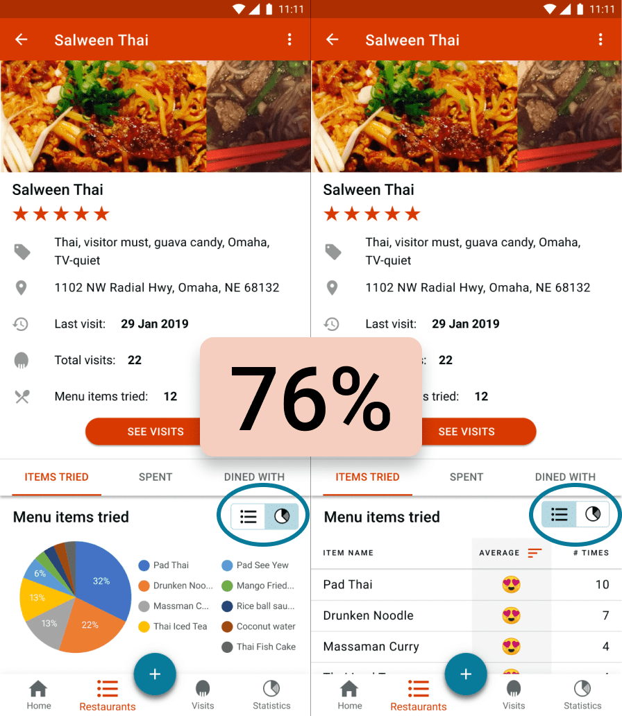
3. Having a different view options between a list and pie chart view seemed like the smartest way to make everyone happy in the way data was presented. The biggest questions was what the most intuitive way of switching the views would be. In preference testing three options, I found that 76% of testers preferred the toggle beneath the tabs. You can see the new design also features better adherence to Material Design guidelines below the photo carousel.
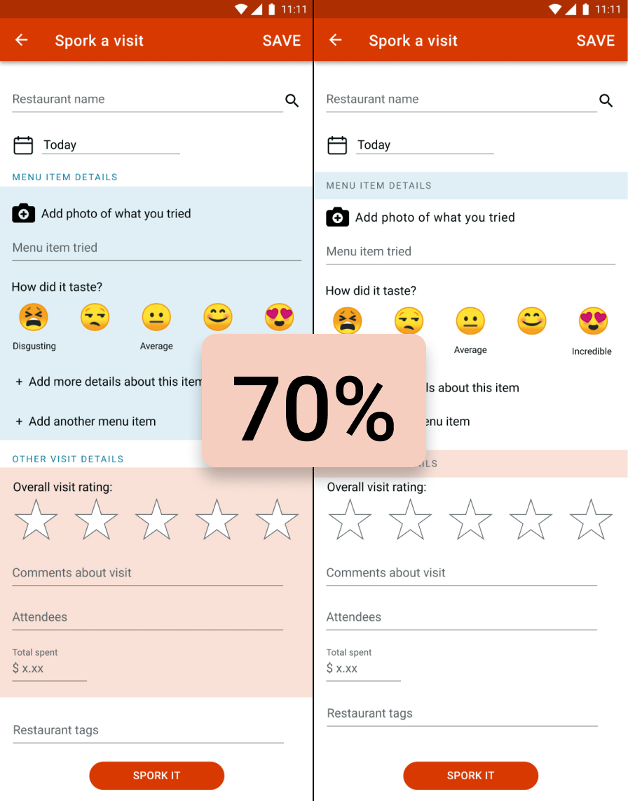
4. With the "Spork a visit" page feeling long, I wondered if I should separate the sections. Sure enough, after preference testing the screens below, I found the majority of users (70%) preferred each section having a clear anchor. About 35% preferred the single lines of background and another 35% preferred the longer colored backgrounds. You can also see here the change I made to the "add a photo" icon, based on user testing observations that the picture frame icon wasn't clear.
Conclusion
Final Thoughts
Besides basic takeaways about how people use apps, I learned a lot from designing Spork that I intend to apply to future design projects:
1. It’s worth it to investigate apps that aren’t direct competitors. When doing my competitive analysis I should’ve have looked up other apps that track anything (not just traveling, restaurants, or board games). I found out about Untappd and aTimeLogger after mostly completing the design of my app.
2. It’s okay to add questions to a survey shortly after it’s been deployed. I added “Photos of meal” as an option after several people had already taken the survey, and still had 59.5% of all respondents (including the initial takers who didn’t see the option) select this feature. If I hadn’t added that option later, I might not have realized until much later, after designing and testing wireframes, how important photos were.
3. When it comes to user testing, more than notes are needed. I realized after taking notes on the first four tests that it would be tricky to try to comb through the notes to compare where users experienced similar things. I wanted a more systematic approach to analyzing user testing feedback, especially because I intended to do lots of user testing for this project. I found a great spreadsheet on Medium that I modified slightly. I took the time after each test to record my observations (or mark if they were repeated). You can see my final user testing spreadsheet here. While improvements could still be made to how I organize my findings, especially if I were to present them to stakeholders, this spreadsheet was a huge help to prioritizing changes. I will definitely continue to take extra time to organize user testing observations and look forward to refining my process even further.
4. It’s important to develop more screens than might feel necessary for prototypes, like a blank log-in screen and one that filled out so users understand they’re not actually typing anything. When search fields are included, it’s also important to show users how it would work so you can get feedback on it.
5. It’s important to set reminders to check back consistently at user personas. I thought I just remembered everything about them as I was designing, but when I had finished designing, I saw that I was mistaken. One of my personas biggest frustrations was not being able to share his statistics with friends from within the BG Stats app. Fortunately, shareability didn’t come up during the user surveys; it was mentioned only in one user interview. While this is easy to just write off as “not being part of the MVP”, completely forgetting about it showed me the importance of continually checking my design against my personas.